SB Technology Corp. (Headquarters: Shinjuku-ku, Tokyo, President & CEO: Shinichi Ata, hereinafter referred to as SBT) has announced the launch of SBT 's web font service "FONTPLUS," which combines Japanese and European fonts. As the first installment of ``Mixed Fonts,' Fontworks and Monotype web fonts (4 families, 8 fonts) will be available from October 15, 2020. This is the first mixed font service in Japan among web font services. Customers who are using FONTPLUS can also use it at no additional cost.
■Background of provision
In the design of printed materials, a technique called ``Japanese-European hybrid'' is widely used, which involves adjusting the character size and baseline position of European fonts and then combining them with Japanese fonts. This is because using a European font may produce more professional and high-quality typography than using the alphanumeric characters included in a Japanese font. Particularly in recent years, Japanese texts have increasingly included Western languages, mainly English, and the need for a blend of Japanese and European texts that harmonizes with nature has become even more important.
However, in web design, although it is possible to combine Japanese fonts and Roman fonts using CSS (Cascading Style Sheets), it is not possible to adjust the font size, baseline position, etc. for each font type. You can not. As a result, it is often difficult to maintain a balance between Japanese and Western texts, resulting in an incoherent impression. As a result of interviews with people who are actually active in the web design field, many people said that they have difficulty harmonizing Japanese fonts and European fonts on the screen.
Comparison of mixed fonts (top) and mixed fonts (bottom) using CSS
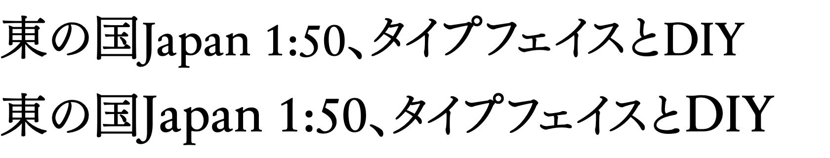
When mixing colors using CSS (above), the European text is smaller than the Japanese text and looks lower.
The mixed font (bottom) is enlarged to 110% in size and shifted upward by 5% to balance it.
■Mixed font details
We select Japanese and Roman fonts that harmonize beautifully from FONTPLUS's extensive library, adjust the font size and baseline position, and provide them as a new web font. Building a website using mixed Japanese and European web fonts can be done with easy settings. The biggest feature of mixed fonts is that they combine high-quality Japanese fonts and European fonts and adjust them to achieve the optimal balance. Development management becomes simpler because Japanese fonts and Roman fonts, which originally had to be specified separately, can be used as one font.
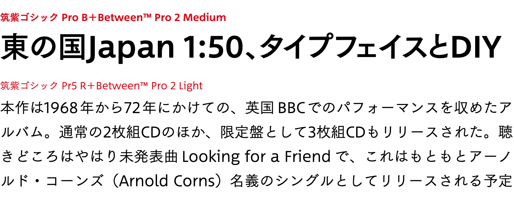
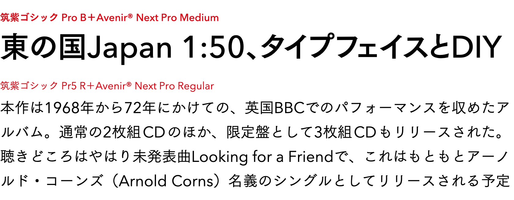
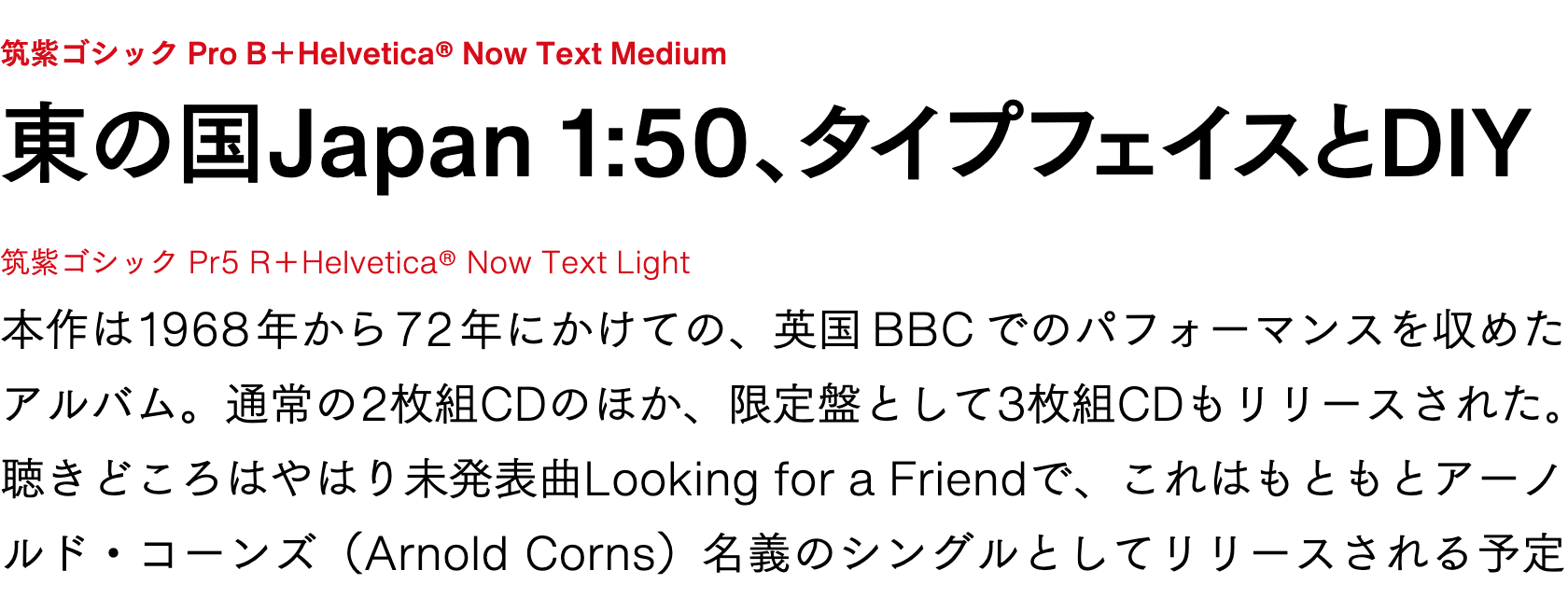
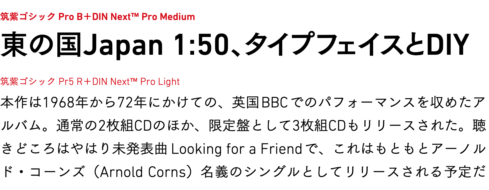
The 8 typefaces in 4 families that we are offering this time are a combination of Fontworks' flagship font, the Tsukushi typeface series, and Monotype's high-quality European typeface, and are mainly composed of those that are easy to use in the body of a web page. In addition, all European fonts are centered on popular standard typefaces, with the latest updated versions taking into consideration readability on screens.
・4 families and 8 typefaces to be provided
- Tsukushi Gothic Pr5 R+Between™ Pro 2 Light
- Tsukushi Gothic Pro B+Between™ Pro 2 Medium
- Tsukushi Gothic Pr5 R+Avenir® Next Pro Regular
- Tsukushi Gothic Pro B+Avenir® Next Pro Medium
- Tsukushi Gothic Pr5 R+Helvetica® Now Text Light
- Tsukushi Gothic Pro B+Helvetica® Now Text Medium
- Tsukushi Gothic Pr5 R+DIN Next™ Pro Light
- Tsukushi Gothic Pro B+DIN Next™ Pro Medium
We have received comments from Mr. Kong, an editorial designer/Roman typesetting consultant who cooperated in providing the first mixed font service.
There are various restrictions when it comes to formatting on the web, so you may not be able to format it the way you want. One of the limitations was the mixing of Japanese and European languages. Many people have had no choice but to make compromises because conventional typesetting methods cannot be used for printed matter. Those who have had such difficulties will be freed from this "limitation" with the "mixed font" released by FONTPLUS.
There are as many combinations of Japanese and European fonts as there are existing fonts, but in order to use them at a practical level, they must not only have good balance and readability, but also be impressive in addition to looking natural. It is important. FONTPLUS's "mixed fonts" have been selected with exquisite combinations that meet these conditions. Please make beautiful Japanese-European mixed typesetting, which was impossible until now, possible on the web.
Editorial designer/European typesetting consultant
Kon Toyoko
SBT will continue to actively work to improve FONTPLUS' services and develop it into a more useful service in the web production field.
Click here for more information about FONTPLUS.
▼ https://fontplus.jp/
■Details of 4 families and 8 typefaces
We have prepared 4 families that combine different European fonts, centered around Tsukushi Gothic, which is highly popular as a web font. The Roman fonts are Between™ 2, Avenir® Next, Helvetica® NowText, and DIN Next™, all sans-serif typefaces that are extremely popular with designers. There are R (regular) and B (bold) weights, which are easy to use on the web.
Contact information regarding this press release
● SB Technology Corp. Corporate Communication Group Person in charge: Yoshida, Yogi
E-mail: sbt-pr@tech.softbank.co.jp